Thoughts come to me from all directions. No seriously, out of the ether. They also arrive at all times, even when I’m sleeping. I dream of showing crazy homes to my clients or building a new house with my wife or practically anything.
The other day I thought, “I wonder if the Internet knows where most of the people who are living here in Kentucky came from?” Sure enough, that information is out there, if you hunt for it.
Kentucky population changes can, of course, be found on census.gov. The site has tons of data, but it’s not presented as well as it could be. Even still, it’s the official record. Currently, it says that Kentucky has 4,425,092 citizens. That’s an estimate apparently, even though we’re past that date. Go figure.
That’s only up 2.0% in the past five years. Seems like it should be more, doesn’t it?
Let’s dig deeper.
Then I found this article by the New York Times, Where We Came From and Where We Went, State by State.
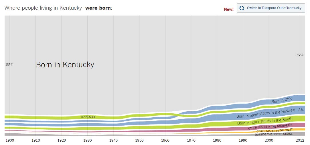
From this chart, we see that back in 1900, 88% of Kentuckians were born in the state. In 2012, that number is now just 70%. Makes sense as we’re a more transient people these days. Ohio is sending 5% of our newcomers, Tennessee 2%. According to this piece, every other state is 1% or less.
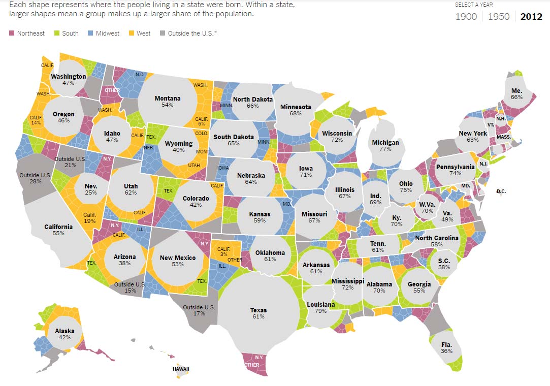
For some perspective, here are the percentages of people born in their state in 2012:
- Ohio: 75%
- Indiana: 69%
- New York: 63%
- Tennessee: 61%
- California: 54%
- Florida: 36%
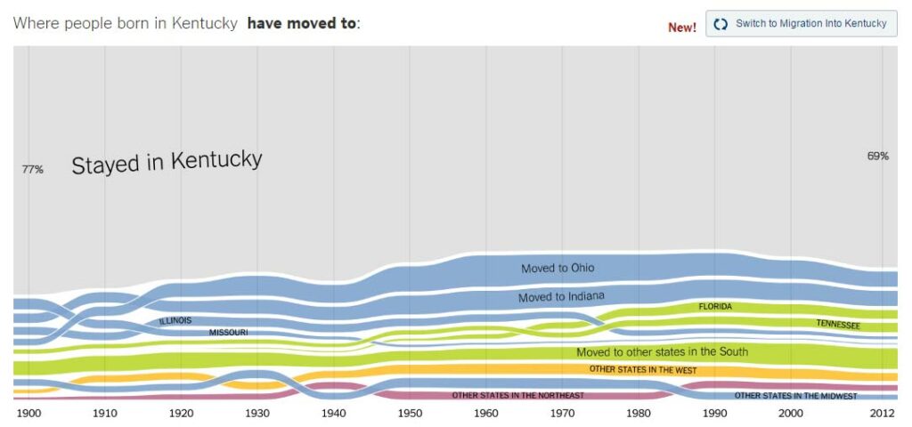
As far as moving, here are the top destinations for people leaving Kentucky:
- Ohio: 6%
- Indiana: 6%
- Florida: 3%
- Tennessee: 3%
- Illinois: 1%
That’s a bit surprising. I would have guessed higher for Florida. Indiana and Tennessee are both beating Kentucky when it comes to new jobs so that’s logical but why is Ohio so much? Guess people don’t want to go too far from home.
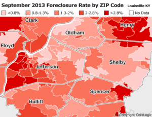
Another cool map is this one!
So there you have it. Just in case you didn’t already know it, you can find almost anything on the Internet—even Kentucky’s population changes.